Chart Reports
Visualize balance values over time with Bkper Charts — drill into Group hierarchies and analyze trends interactively.
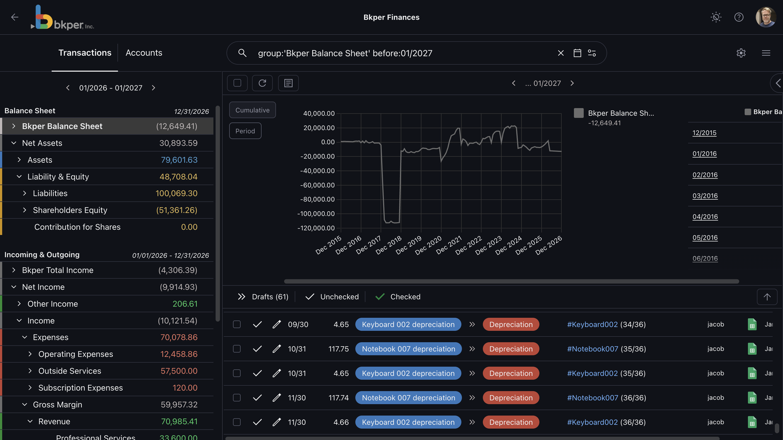
Bkper Charts visualize balance values across time. They help you inspect trends, compare Groups and Accounts, and move from a summary balance to the transactions behind it.
Charts are query-driven: they reflect the current Book search, selected date range, and Account or Group scope.
Use Charts when you need to:
- understand how a balance changed over time
- compare balances inside a Group hierarchy
- inspect period activity for Incoming and Outgoing Accounts
- drill from a Group total into child Groups or Accounts
- filter the transaction list from a chart selection
Opening Charts
You can open Charts from balance values or from the chart control in a Book.
A useful pattern is:
- Start from the Book search or Balance Sheet.
- Select the Account, Group, or query scope you want to analyze.
- Open Charts to see the matching balance values over time.
Reading Charts
Charts show balance values for the current query.
The meaning of each value depends on the Account type:
- Asset and Liability Accounts are permanent. Their chart values show the cumulative position at each point in time.
- Incoming and Outgoing Accounts are non-permanent. Their chart values show activity within the selected period.
- Groups consolidate the Accounts or child Groups below them according to the Chart of Accounts hierarchy.
Use the hover details in the chart to inspect the value for a specific date or period.
Changing the period
The query controls how many balance points the chart shows.
Use by: operators to change periodicity:
| Operator | Chart grouping |
|---|---|
by:d | Daily values |
by:m | Monthly values |
by:y | Yearly values |
Example:
group:'Revenue' after:$m-12 by:mThis charts Revenue values by month for a rolling 12-month window.
Drilling down through the hierarchy
Charts follow the same hierarchy as the Chart of Accounts.
For hierarchy details, see:
When the chart is showing a Group, select that Group in the chart to move one level deeper. You can continue until you reach individual Accounts.
For example:
- Start with a top-level Group such as
Net Assets. - Drill into child Groups such as
AssetsandLiabilities. - Drill further into subgroups.
- Select an individual Account to analyze only that Account.
Use the back control in the chart panel to move back up one level.
Analyzing transactions from Charts
Charts and transactions stay connected.
When you select an Account or chart series, Bkper updates the transaction list to match that scope. This lets you move from a visual trend to the transactions that explain the movement.
Use this workflow for investigation:
- Open Charts for a Group or query.
- Find a period or value that looks unusual.
- Select the related Account or series.
- Review the filtered transactions.
- Adjust the search query if you need a narrower view.
Working with search queries
Charts always reflect the current search query. This means you can combine Charts with query operators.
Examples:
group:'Revenue' after:2025-01-01 before:2026-01-01 by:mCharts monthly Revenue activity for the 2025 calendar year.
account:'Bank Account' after:$m-6 by:dCharts the Bank Account daily position over the last six months.
group:'Expenses' NOT "one-time" after:$y-1 by:mCharts monthly Expenses over the last year while excluding transactions that match one-time.